Saturday 16 December 2017

THE ULTIMATE TRAVEL COMPANION

Recently I was fortunate enough to review the Huawei Mate 10 Pro, a phone that impressed me so much, it was hard to include all its great features in one article.

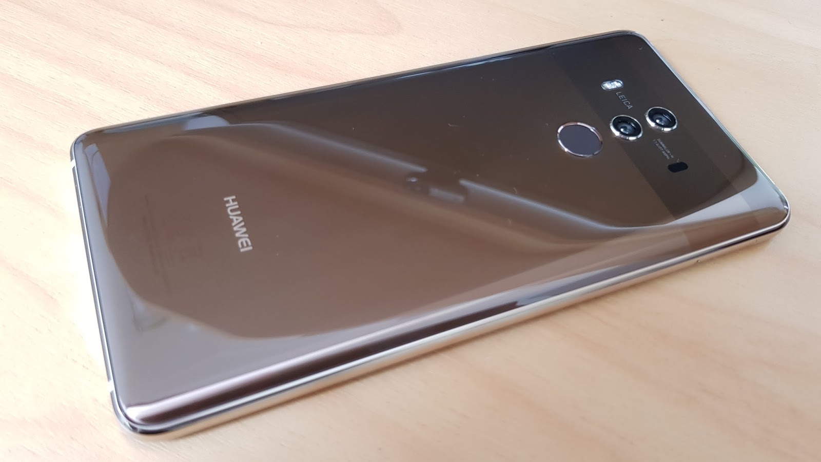
One feature in particular is so groundbreaking and unique, on reflection, I've decided to give it a bit more attention than the two and a half line paragraph it got in the original story...


Huawei Mate 10 Desktop Mode is more than just a gimmick; it has the potential to turn your phone into one of the most versatile business tools you can imagine.

If you currently do business on the road, or you're required to travel as part of your job, either nationally or internationally, chances are you're already using your phone to carry out tasks many other people  perform at their desks.

Staying in contact via email, social media, maintaining your calendar, web stuff... all of these things can be handled with your handset - to one degree or another.

However, when it comes to creating and managing documents and presentations, or editing pictures and video, that's usually when the laptop comes out of the bag. By choosing a Huawei Mate 10, you may well be able to leave that laptop behind altogether.

What's more, the only extra piece of equipment you'll need is a single USB-C to HDMI cable so you can connect your phone to any screen with a spare HDMI port.

You'll be presented with a PC desktop-like screen seconds after you plug the phone in but unlike other similar systems I've trialled, your Mate 10 phone remains fully functional as a phone, even while it's running your new desktop experience.

Alternatively, you can choose to use your phone as a virtual track pad and keyboard.

These options are very easy to find and simple to use.

Obviously the most efficient setup of all is to add a bluetooth or wireless keyboard/mouse into the equation, which is exactly how I'm writing this review now. It works, it's so straightforward and once you start working through all the practical uses, it starts to sound a bit essential.

Let's just think about the practicalities involved moving through places like airports without having to worry about taking a laptop out every time you go through security, finding somewhere to stow it on planes with the rest of your carry-on. Even hefting less weight around has to be a bonus.

Now consider how much more connected you can be in your hotel room - if it has a TV, it has an HDMI port for you to plug into. This of course means you now have total desktop access to your work files, both stored on your phone and in the cloud. Even better, once you've clocked off you're no longer restricted to whatever channels the hotel has to offer; your Netflix favourites can be easily shown from your phone onto their screen.

Then, perhaps the next day when you arrive in that overseas office for your big presenation, there's no special projector software or WiFi network password chaos involved - just plug in the Mate 10 and your phone is the exact same, familiar presentation device you practiced on back in your hotel room.

No laptops involved.

Even gaming is possible, because unlike the screen mirroring function other devices rely on, there's virtually no lag when connected via a physical cable.

One big negative for me is the battery issue. Running HDMI is relatively power intensive and although you're connected via the Mate 10's charging port, don't be fooled into thinking that cable is charging the phone at the same time. Especially if you've connected a wireless keyboard and mouse too, you're battery life is going to seep away pretty much before your eyes.

Oh, you'll still have plenty of juice for that presentation or movie, but probably not a Star Wars triple feature!

Luckily, the Mate 10 Series phones all support Huawei’s SuperCharge fast charging system, so it shouldn't take too long to get all topped up again.

For sheer convenience, portability and ease of use, Huawei Mate 10 Series Desktop Mode is something any regular business traveller needs to investigate.

Monday 4 December 2017

TAKING A GOOD HARD LOOK AT MYSELF... IE

As I've said many, many times before; I'm not a fan of selfies.

The main reason? I'm usually in them. Nobody wants to see that.

But what if I could take selfies that actually make me look, you know... okay?


Study this picture very carefully and you might discover the little thing that makes the Huawei nova 2i quite unique. It's up at the top there. Right next to the camera. Yup. Another camera.

While there are plenty of phones out there offering some kind of dual-lens configuration for the rear-facing (or main) camera, the nova 2i is the first one I've encountered to bring those same features around to point at my face.

The results are quite simply breathtaking.

Often, when you read smart phone reviews, there'll be a lot words written about the performance of the rear-facing (main) camera, with a few lines tacked on to talk selfies. I'd suggest the nova 2i is such a game-changer, the (main) needs to be shifted to that front-facing camera too. Half the people I know take most of their photos with that camera so they can plug themselves directly into the Matrix. Why wouldn't they consider that camera to be the (main) one?

This is definitely the phone for them, no contest.

All the effects, filters and special settings available on the rear-facing camera can be applied to your selfies too. Most importantly, the now legendary bokeh effect (sharp foreground, blurry background) is simply an on-screen icon push away.

There are two other features that magically brought my selfies to life. Firstly, the Smile Capture setting. This is definitely the most natural way to get the camera to catch you in a more normal pose, rather than reaching for the camera button, especially if you're not using a selfie-stick. What's more, it really works. Admittedly, if you're going for a group selfie, only one of you has to be smiling for the photo to happen - but that usually results in a group smile anyway.

Secondly, and just go with me for a moment here, I actually dabbled with Beauty Mode. Don't worry - I'm not talking eye enlargement or a weirdly skinny face. There's an easily accessible icon on screen that lets you ramp up (or down) the beauty mode. It's mostly about evening out skin tone. Whereas previous "Beauty Modes" have resulted in making me look like some kind of weird anime cartoon character, I found the nova 2i's setting was much more natural, removing unsightly blemishes like wrinkles. And age. Nobody ever complained about that.

Of course, this is not just a selfie machine, it's a phone as well. If it doesn't perform like one, there's no point, right? Luckily, the nova 2i is a pretty decent phone. You'll find many of the features of Huawei's most recent high-end Mate 10 range on this device too. It has excellent battery life and multi-tasks well. While the operating system isn't the latest or greatest, the EMUI 5.1/Android 7.0 combo isn't clunky at all. What's more, you get my favourite (and hardest to find) function; a rotating home screen, from portrait to landscape, something I consider essential on a device with a screen of this size.

The nova 2i boasts a 5.9" display, with that new 18:9 long, skinny profile all this year's coolest phones have. The screen is pretty much edge-to-edge, and with the super-fast fingerprint sensor on the back, there are no physical buttons to clutter up the front of the phone. This means a genuinely big display, but on a phone that still fits easily in one hand.

The metal rear casing is solid and attractive, giving the impression of a very high-end phone indeed. There are plenty of other high-end specs here too; 64GB of built-in storage and 4GB of ram. Once again, Huawei manages to squeeze more performance out of the nova 2i's Kirin processor than black-and-white numbers suggest. Operation is fast, smooth and reliable.

Only one catch really... the price. You won't be boasting to impress your friends.

Unless they love a bargain. The nova 2i is only $499.

No typo.

$499.

Are the best selfies you've ever taken worth $499?

You'll find the phone with 4 cameras in a most unexpected price range, just in time for Christmas.

Say, "Cheese."


Click here for more information on the Huawei nova 2i

Tuesday 7 November 2017

BEAUTY IS SO MUCH MORE THAN SKIN DEEP

Huawei is a premiere phone brand.

Trouble is, even now, especially in New Zealand, not everybody knows it.

That could be about to change, because if the latest Huawei offering isn't the best phone of 2017, it's certainly in the top three.


One thing's for sure, the Mate 10 Pro is definitely the prettiest phone I've seen this year.

Usually I'll go for the tried and true (and admittedly, boring) black when it comes to handset colour. I feel like white has done its dash and I know it's sexist to say, but gold is just too girly for me. (By that I mean, as a mere male, I don't deserve nice things like gold)

Silver is functional, but industrial and while some phones have had other brightly coloured variants, if they're too garish, the whole operation starts looking a bit cheap. Don't ask my why, it's just the way it is.

I'll stretch to a very dark blue if I have to and in a perfect world, my phone would come in metallic blood red.

Meanwhile, the mocha of Huawei's Mate 10 Pro will do me just fine. It's a luxury colour. Soft, but sophisticated. More subtle than gold... almost an antique look to it. Mocha is classy - which is appropriate, because everything about the Mate 10 Pro is classy.

For the first time, Huawei has wrapped the whole device in glass, front and back, which gives it the premium feel we've come to expect from high end products by other manufacturers.

The rear dual-lens camera is set in a contrasting stripe (I think of it as a racing stripe) and I wonder if this is inspired by Huawei's recent partnership with the Porsche design team.

The impressive 6 inch display curves slightly at the edges, combining ergonomically with the arc of the back panel to ensure this phone is not at all slippery to hold. Rather, it's silky smooth and comfortable in the hand.

One handed operation is surprisingly doable for a handset with such a large screen. This is partly due to the edge-to-edge nature of that display, which allows the Mate 10 Pro to be significantly smaller overall than 2016's Mate 9 - even though last year's screen wasn't as big.

The other one-handed feature is the fingerprint sensor, ready and waiting for your forefinger in the centre of the back panel. You know... where your forefinger naturally sits. It's even slightly recessed to make it impossible not to find. It's lightning quick, unlocking and opening the phone to the last used screen instantly.

In fact, everything about the Mate 10 Pro is lightning quick. If you thought the Kirin 960 chip in the Mate 9 and P10 had things humming, the Mate 10's Kirin 970 is yet another leap forward. Huawei has spent millions on R & D to develop an Artificially Intelligent phone brain that is truly next level.

Much of this AI functionality has been directed to the cameras. On the back, one Leica lens is 20MP monochrome, while the other is a 12MP wide-aperture Leica to let in the most light possible. Not only does this mean a range of on-trend "bokeh-style" dual focus effects, but with the widest aperture lens on the market, low light shots are no longer hit and miss.

But back to the Mate 10 Pro's massive brain.

Since becoming one of the first phone makers to incorporate dual-lens technology into its handsets, Huawei has offered the potential to snap photos of the highest quality - if you knew what you were doing. Often I found I had to play around with the expert settings (which to be fair, have always been just a swipe away) to get my shot just right.

Now the Mate 10 Pro literally does my thinking for me. This new age of photographic A.I. means the phone already recognises millions of images and keeps learning on the job. So point the camera at your dinner, a little knife and fork symbol appears and the shot becomes instantly Instagrammable. Frame up a pretty tree and the flower symbol comes on, ensuring those blossoms look prettier still. Portraits are recognised straight away - group or solo. These cameras really are the final word in point and shoot.

Oh, and there's a neat trick; The 3D panorama shot which renders a VR style picture you can pan around by swiping or just by moving the phone. You can also use this effect shooting around your subject, resulting in a portrait you can see all sides of.

This is quite simply the most user-friendly and fully-featured camera configuration I've encountered to date.

With 128GB of on-board storage, you'll have plenty of room to store your nice new pics too.

Of course, all that processing power pays off with the rest of the Mate 10 Pro's operation. Whether it's the downloading and installation of apps, streaming, browsing or multi-tasking all those things, you just can't slow this beautiful beast down.

Especially given its massive battery, at 4000mAh, surely one of the biggest on the market. Fully charged, you'll easily pump through a full day, if not two depending on your binge-watching habits. Sometimes a high-capacity battery means an inconveniently long charging time. Not the case with the Mate 10 Pro - it comes with what Huawei calls a "Supercharger" and yes, it is very quick. Sadly, still no wireless charging from Huawei. Maybe next year.

Another unique feature offered by the Mate 10 series is Desktop Mode - simply plug into any screen with an HDMI port and you've converted your phone into an ultra-portable PC, no dock required.

Nobody's perfect, and while some features of the Mate 10 Pro come close, one or two fall shorter than I would have expected. The Mate 10 Pro carries an IP67 dust and water resistance rating, certainly better than nothing, but not fully submergible like some of its IP68 competitors.

The Mate 10 Pro is also part of the new phone breed to spurn its headphone socket, you'll have to use the earbuds with the USB-C connection included in the box or buy an adapter. I use bluetooth earbuds so this didn't bother me in the slightest.

Perhaps most significantly of all, (if you're a geek like me) the Mate 10 Pro is built on Android 8.0 (Oreo), the first such device widely available in New Zealand. This means a noticeably improved settings interface with many more customisation options. Combined with Huawei's latest EMUI operating system, I finally have almost all the features I demand from a large-screen device. Why don't all smart phones offer a home screen that will rotate to landscape? Or side-by-side email display?

Because there aren't any phones that can do all the things the Mate 10 Pro can do.

That's why it makes my top three phones of the year... and at $1299 it's actually several hundred dollars cheaper than the other two.


Click here for more information and pricing on the Huawei Mate 10 Pro

Wednesday 18 October 2017

WHAT MORE DO YOU REALLY NEED?

How do you make a budget phone?

Do you start with an empty slate and fill it up till you've met your price point?

Or do you start with your premium device and strip features off it until it's affordable?

Whichever way they did it, I'm here to tell you, Huawei have come up with a damn fine phone for $249...


There's a lot the Huawei Y7 doesn't do.

There's no fingerprint sensor. It doesn't charge wirelessly. In fact, it still uses a microUSB not USB-Type C. (how quaint)

There's no second screen on the back. It isn't waterproof.

As for the camera, well... Given Huawei was one of the dual-lens pioneers and has been producing handsets with amazingly high-specced cameras for years now, the lack of performance from the camera on the Y7 is surprising to say the least. For starters, the rear-facing camera is only single-lens and while it can shoot up to 12MP, I found the results merely average. Picture quality was adequate in good light conditions, but after dark things get a bit ropey. It's by no means the worst camera on a phone right now, but if photography's your passion, this is not the one for you.

So is the Y7 so bad, it's not even worth $249?

No.

In fact, I reckon you could pay three times that and you'd still be happy with the Y7's performance.

All the limitations I've just listed are really just optional extras that haven't been added on. When it comes to the way this phone actually runs, it purrs like a sports car.

As I always do, I used the Y7 as my personal phone, attempting to all the things I normally would with my phone every day. Usually with a device in this price range, I can't wait to get back to my go-to handset, frustrated by a lack of power and various shortcomings when it comes to what the phone is capable of, under the hood.

By stark contrast, the Y7 was a genuine pleasure. Somehow Huawei keeps managing to get more than seems technically possible out of the processors they install in their handsets. The Y7 isn't even equipped with the famed Kirin chip you'll find in Huawei's premiere devices. Instead, the more commonplace Qualcomm Snapdragon brain is running things here, but it's doing a stellar job.

Whether connecting to bluetooth and WiFi accessories or streaming video, there really doesn't seem to be any task too taxing for the Y7. I really think this may be the most powerful phone I've encountered in this price bracket.

Appearance-wise, the Y7 may not win first prize in a handset beauty pageant, but its metal casing, while slightly industrial, certainly lends itself to a solid, dependable feel.

The 5.5inch display is another plus-sized feature included for not much money. That's plenty of on-screen real estate for pretty much whatever you want to watch - and like Huawei's other 2017 handsets, you can run the Y7 in Te Reo if you prefer.

The other major feature is the massive 4000mAh battery. Again, this kind of battery life is something you hardly ever find below the $700 line, let alone below $250.

The only limitation that really bothers me is the Y7's lack of internal storage. 16GB is simply not enough these days. Sure you can easily store your music, video and pics on a microSD, but there are certain fundamental apps that run better when installed internally, and by the time you take away the space required by the operating system and other pre-installed software, you're not left with much room to move.

In saying that, I filled the memory up pretty chocka and things still kept ticking along smoothly, so perhaps adding in that microSD might be all you need to convince yourself the Y7 is a thousand dollars better than you paid for it.

Ask yourself, do you need a great camera? Do you have to have the prettiest phone on the table? If your answers are "no" and "no" give the Huawei Y7 a go.


Click here for more information and pricing on the Huawei Y7

Wednesday 13 September 2017

THE PEAK PHONE DEBATE

What more could we possibly ask for?

How good do these phones need to get before we're satisfied?

For some time now, we've been offered features and functions we hadn't even thought of, let alone demanded.

Turns out, there's always something better and besides, after a firey 2016, Samsung is still on the road to redemption...


Without dwelling on the disastrously flammable fate of last year's Galaxy Note7, there's no escaping the fact Samsung has taken a bold step continuing with the Note brand at all. It's a testament to the devotion of Note users that many of them have simply waited all this time to upgrade their existing phablet.

This means they could still be using the Note5, released this time in 2015 and will be itching to get their hands on some of the developments Samsung have offered over the last 2 years.

Of course, the Note5 was (and probably still is) a fantastic phone. Big screen, curvy back, fast processor, fingerprint sensor - even wireless charging. (That's right, you iPhone addicts - Samsung has literally been doing it wirelessly for years)

The Note5 introduced the clickable S Pen too, a stylus that actually feels like a pen, with a lot more functionality.

Probably the best phone of 2015 by quite some margin. So if you're still using one today, you'll be feeling pretty smug about the fact other manufacturers are only now starting to successfully copy some of those features.

There wasn't a Note6. In order to sync up with the Galaxy S releases, 2016 meant the Note7 instead. As we now know, too hot to handle.

So how far has the Note come since August 2015?

I was a little surprised the first time I encountered the Note8 at its lack of curviness. For some time now, Samsung handsets have been whittling away the edges both front and back, pioneering the now famous no-bezel appearance. While the Note8's display does still reach right to the edge, there is now a noticeable ridge between the screen, the frame and the glass back. I believe this is supposed to make the phone easier to hold, but for me, it just makes it more uncomfortable and less sexy to look at.

In fact, due to its sheer size and weight, I initially felt as though this is probably the hardest-to-hold phone I've ever tried to get a grip on.

But, as is often the case, first impressions can be deceiving.

While both the Notes 5 and 7 featured 5.7" screens, the Note8 clocks up a mighty 6.3 inches. I assumed this would make it impossible to fit in my pocket but like the S8 and S8+ from earlier this year, the screen is much longer (or wider, depending on which way you're holding it) due to the 18.5:9 aspect ratio. In other words, the Note8 isn't fat, just tall.

So while the glassy finish and sharp edges make it slippery, at least it's still narrow enough to wrap one hand around.

What keeps the Note8 looking better than many other phones in its class (not that many are in its class) is the fact the dual-lens rear camera now fits completely flush with the back of the handset, making it less prone to dirt and scratches. Although some people lost their minds when Samsung moved the fingerprint sensor from front to back on this year's S8s - it's still there, thankfully, as it's the obvious place for a finger to go when you're holding a phone this big in one hand. In response to the moaners who were too uncoordinated to keep their fingers off the camera lens, Samsung have moved the sensor slightly further away by placing the flash in between.

The other important physical feature of any Note, is of course, the on-board S Pen. Still the most versatile stylus available, you can draw, write, highlight, select, drag and drop more effectively than ever. There's something tactile about clicking the S Pen out of its slot to make a quick note - even when the screen's off. This season's S Pen can help you translate whole passages of text with one easy selection. There's also a fun feature called Live Message, which creates an animated Gif of your hand-written note you can then send to someone else. Very bespoke.

I could rabbit on at length about the speed and reliability of the Note8, but the sad fact is, I take all that stuff for granted now. Samsung have been making amazing devices for a long time and I've been using them for so long that it's only when I'm reviewing another brand I appreciate just how well every part of a high-end Samsung works. In saying that, the processing power of 6GB is not to be sneezed at, but that's the sort of grunt you need for the top-level dual-lens photography on offer, not to mention the Note8's multi-tasking abilities, now enhanced by a new Edge Panel feature that allows you to open two apps with one swipe.

In fact, I used to find the Edge Panel used to be a bit of a gimmick but it's now been refined to be genuinely useful, accessible even from a locked screen if you like.  Your calendar, favourite apps and contacts are now only a swipe away.

I remain less convinced about the practicality of Samsung's virtual assistant, Bixby. Like the S8s, there's a dedicated Bixby button on the Note8, with more and more Bixby functions being introduced all the time. I'm not really sure why we need Bixby when all Android phones offer Google Now already. In saying that, I have definitely made use of some Bixby features, especially converting images to text (like a scanner). This is one trick Bixby performs really well.

I was surprised by the sound quality offered by the Note8. Strangely, still no stereo speakers here but in terms of sheer volume, I was impressed. What's more, the latest bluetooth connectivity seems more reliable and powerful than ever. Me likey.

There are so many other features that make this a great phone, but as I've already said, you'll find most of them on previous Samsung devices. Fast, wireless charging, water resistant, amazing battery life, user-friendly yet high quality cameras, brilliant accessories... it's all there.

As for the exploding elephant in the room, I have talked to the Samsung people personally and they have convinced me their new safety and quality control regime is rigorous and includes independent checks to ensure these phones keep their cool. Given the success of the Galaxy S8 and S8+, it looks like they're on the right track.

At $1599, the Note8 had better be the coolest phone you've ever experienced. It probably is. 

What's more, if you're still using that Note5 from 2015, definitely time for an upgrade.


Click here for more information about the Samsung Galaxy Note8

Tuesday 5 September 2017

BEST CAMERA FOR THE COST

I don't do selfies.

The last thing I want to see online is an image of me.

As result, I've never really made camera quality a priority when it comes to choosing a smart phone.

But some things are just too good to ignore...


There's a reason Oppo labels its handsets "camera phones." As far as sheer megapixel power goes, I'm not aware of another phone that matches up to the Oppo R11.

Not only does the R11 boast the same dual-lens configuration you'll find with the rear facing cameras on the latest top-of-the-line models from Samsung and Apple, the lenses on this Oppo device are even higher specced - at a whopping 20 and 16MP.

What's more, the forward-facing (selfie) camera is also 20MP.

This adds up to an insane amount of photographic fire-power, especially when this phone is literally less than half the price of some of those other handsets.

Of course, none of this cool camera craziness means anything if the rest of the phone doesn't match up. Well I'm here to tell you, given Oppo only arrived in New Zealand earlier this year, now they've definitely moved in for good.

From the moment you pick the R11 up, you can't help but be impressed. It's ultra-light and super-slim, but the metal casing means the phone feels sturdy, not flimsy.

The best, most unique physical feature of the R11 is its natural curve - the rounded back fits into your palm snugly like a phone-shaped glove. Those aforementioned dual-lenses are the only slight blemish here; because the camera is so grunty, it's too large to fit seamlessly into the casing so has a slightly raised edge. This isn't really a negative I suppose, more a feature of this phone's stunning design.

Some people have compared this device's appearance to the latest iPhone, but that's a bit unfair... to the iPhone. The R11 is much better looking, with none of the square, boxy edges you'll find on the Apple device. Everything about the Oppo is bevelled, rounded and curved - even the dual-antenna strip looks more like a racing-stripe than something functional.

Under the hood, the pleasant surprises keep coming. The Qualcomm SDM660 processor provides enough brainpower to push things along at a reasonable pace. 4GB of ram is sufficient to multi-window two apps at once, making use of the R11's ample 5.5inch screen space. 64GB of internal storage seems to be the standard with top-end phones these days, but there's an SD slot to expand this if you need to. However, you may choose to use that slot for a second sim card. The R11's dual sim functionality is easy to access and means you can take full advantage of different plans, or keep work and private phone use separate, in a single handset.

Till now, I haven't been a fan of Oppo's own operating system, ColorOS which is built over the top of the more flexible Android foundation. On the R11 version though, there's a lot more functionality, with a new settings shortcut window you can pull up from the bottom of the screen, giving you instant access to functions like Do Not Disturb which were hard to find on previous iterations.

Still no app drawer though, so you'll be stuck with as many home screens as it takes to fit all your apps on.

The fingerprint sensor (under the home key) isn't just fast, it's lightning. I don't know how Oppo does this, but I'm glad they do.

The 3000mAh battery, while not the biggest available, might well be one of the fastest-charging, thanks to Oppo's VOOC "flash-charging" system which means even if you're starting to run low, plugging in for as little as five minutes can buy you another 2 hours talk time. Oddly, Oppo's still using microUSB rather than the more versatile USB-C connection. That said, I now have so many phone cords and adapters floating around my house this kind of thing makes little difference these days.

But we really have to finish where we started. The cameras are genuinely impressive - even for a guy like me who isn't usually that impressed by cameras. You can choose either the telephoto or wide-angle lens on the back, or do what I usually do and leave it to the phone to decide. The much hyped "bokeh" or blurred-background effect is so easy to achieve with the R11, I used it on everything, making me feel like a real artist.

The selfie camera isn't just high-res, it's packed with more options than a Subway sandwich with everything on it. You can take pics by waving your hand at the phone - ideal for group shots on the end of a selfie-stick. The camera will automatically optimise the shot if there's two of you in it instead of one. But my favourite has to be the filters - not just available for stills but for video too. My Insta feed never looked so nostalgic.

All of this sounds like premium stuff and it really is. From the way it looks, the way it feels to the way it performs and of course, the R11's stunning photos, this is the most fun I've had with a phone for a while. For under $770, it's hard to justify buying anything else.


Click here for more information on the Oppo R11

Tuesday 15 August 2017

A PHONE OF TWO HALVES

For too long New Zealand telcos have kept us chained down when it comes to using different sims in different devices.

In fact, it's a pretty clear example of the bad stuff that can happen when there's not enough genuine competition in a given market. While mobile customers in other countries have easy access to dual sim devices and standalone sim devices like smartwatches that can connect to mobile networks independently, we've been left out in the cold.

Oppo has now changed all that.


The 5.5inch A77 (and the slightly smaller 5.2inch A57) feature the first genuine dual-sim slots I've seen available on the New Zealand market. A few other handsets (generally only available from 3rd party retailers) have had the option of inserting a second sim in the microSD slot, but that's stupid because then you can't use an SD card as well.

So why do you need two sims in one phone and why do telcos not like it?

The answer is basically freedom.

Different phone companies offer different plans and rates. Data, texts, calls - depending on who you're connecting with and when, you may want to take advantage of more than one plan at a time. Dual-sim capability lets you do that.

Perhaps more importantly, if your company provides you with a phone, chances are they have some fairly clear restrictions on how much data and call time you're allowed for personal use - but obviously carrying two phones around would be a major pain in the bum. The Oppo A77's dual-sim slot means you're using two phones in one.

Of course, none of that matters if the phone isn't any good. Luckily, the A77 is good. Very good.

To begin with, this phone really is one of the classiest looking phones around. Available in black or gold, the metal body is extremely slim and in spite of the large 3200mHa battery and ample 5.5inch display, the A77 feels remarkably light in your hand.

There's a fingerprint sensor under the home key (not a physical button, just looks like one). This is one of the fastest I have used so far. Speaking of speed, the A77 is actually pleasantly quick - as it should be with its 4GB of RAM and 64-bit octa-core processor. These are all very high-end numbers but the A77 comes at a decidedly mid-range price.

Right now it's retailing at just $529 and given it's power, camera quality and large 64GB of built-in storage you really are getting bang for buck.

My only major issue with the A77 is Oppo's operating system, ColorOS 3.0. Many phone makers insist on forcing their own look on top of the base Android configuration and this can often make things overly complicated and you can be left to deal with a lot of unnecessary features and unwanted bloatware.

ColorOS 3.0 is kind of the opposite of that. Oppo describes the experience as being, "smooth, steady and lightweight." I totally agree, but while I'm a fan of smooth and steady, lightweight isn't necessarily what I'm looking for, especially when it comes to customisation settings.

While there is a theme store app available, there's very little you can do to change the home-screen layout. Other than any widgets you may use, you're stuck with as many screens of icons as you have apps, iPhone style. No app drawer, and also very limited when it comes to changing up the lock screen and navigation button layout. Accessing features like Do Not Disturb is a cumbersome, multi-step process and unlike most other Android phones, there's no option to search the settings menu for keywords which I definitely missed.

However, that really is the only bad word I have to say about the Oppo A77. I found the battery life to be excellent (as it should be at such a large size) and it performs well when it comes to connectivity, multi-tasking and streaming.

There's no question this is a top quality phone given its mid-range price tag. If you're looking for genuine dual-sim capability, the A77 should be your first stop.


Click here for more information on the Oppo A77

Sunday 30 July 2017

VODAFONE COMES TO THE RESCUE... AGAIN

There's nothing like owning a high-end smart phone with all the bells and whistles.

Ah, the sheer luxury of taking your phone swimming after charging it wirelessly in under 10 minutes.

In saying that, perhaps $1400 is too much to spend on something that can fall out of your pocket on a bus...

We’re at that point in history where technology has advanced faster than we have. Sure we can now buy a phone that slots into a VR headset so we can pretend we’re walking on Mars, but weirdly, not everybody wants to do that.

Even more weirdly, lots of people just use their phones for calling, texting, taking pictures and monitoring their social media feeds.

For these people, a $1400 fast-charging, underwater phone may be overkill.

By the same token, you still want your phone to do that talkie-texty-photo-emaily-social thing as well as you possibly can.

So Vodafone went straight to the Germans.


The German-designed 5” Smart N8 and 5.5” Smart V8 handsets are both very attractive phones as phones go. The V8 is slim, comfortable to hold and has a cool metal feel. As a matter of fact, it has a cool metal look too – it’s only available in a colour called “Cool Metal.” It also appears to be constructed of some kind of cool metal.

By contrast, the N8’s rear casing is plastic but is available in both graphite and gold. Just because the casing is plastic, doesn’t mean it feels cheap. It’s textured and the phone is still solid to the touch.

The other first-class feature you’ll find on both these phones is a rear-mounted fingerprint sensor, situated in my favourite position, right in the centre, just below the rear camera lens. Other manufacturers keep changing their mind on where to put the fingerprint sensor, but the centre-back position makes most sense to me because that’s where your fingertip naturally goes when you’re holding your phone with one hand. I found the sensors worked very efficiently on both phones, unlocking them straight to the home screen.

Interestingly, both phones boast the latest version of Android straight out of the box, with virtually no bloatware. This is good news for people who’ve been frustrated by other phone-makers’ operating systems installed over the top of the one that works perfectly well already.

As for how well these two phones actually run that operating system, this is where the similarities start to end.

The Smart V8 is packed with a lot more processing power and storage space than the N8. In fact, with 3GB of ram and 32GB built-in storage, the V8 purrs along very reliably and smoothly, genuinely on a par with many other high-end phones from other brands. It will run multiple apps simultaneously and has excellent battery life.

When it came to multitasking, the less powerful Smart N8 came up pretty short. Streaming to other displays, screen mirroring, running multiple Bluetooth devices at once, all these activities tended to max out the N8’s processing power, sometimes even requiring a reboot to carry on.

Meanwhile, the appropriately named V8 just kept on trucking.

My other big concern around the N8 is limited storage. 16GB just isn’t enough these days. Yes, you can expand storage via a microSD slot on both handsets. Trouble is, while the V8 features the (now standard) pop-out sim/SD drawer on the side, on the N8 you have to remove the back entirely to access the separate sim and SD slots. Let’s be honest, that’s a major pain.

Camera quality may also be a deciding factor between these two phones. While both run the same camera app, the slightly more limited hardware on the N8 resulted in quite a few blurry snaps. Again, the V8’s pics were much more satisfactory.

None of this means you should write the Smart N8 off as an option and here’s why; $199. If you’re only doing one thing at a time with your phone, you’d struggle to find one this good-looking, with a fingerprint sensor, that works this well for this price.

One "but" though…

Can’t you find another $150? Because the Smart V8 isn’t just $150 better than the N8. I’d say it’s at least $500 better. If you’ve ever regretted buying a budget handset because you ran out of space after a month or it couldn’t run the games your friends were playing on their phones, the Smart V8 is incredible value at just $349.

You can’t use it in the pool, but it really doesn’t have too many other limitations.


Click here for more information and pricing on the Vodafone Smart V8

Or...

Click here for more information and pricing on the Vodafone Smart N8

Saturday 13 May 2017

WHY BIGGER ACTUALLY MEANS BETTER

Plus.

You have to have a Plus model these days. The question is, does that just mean a bigger screen, or have other features been plussed too?...


The Huawei P10 Plus features a 5.5 inch display, which by today's standards, is not massively plussy. The standard P10 is 5.1 inches, so is 0.4 of an inch enough to justify an extra 200 bucks? Actually, for a lot of people it probably is. 

Don't get me wrong, the P10 is a truly excellent phone, powerful, fast, amazing camera, plenty of storage. It's just...

Little.

And to be honest, right at this point in time, people seem to prefer something with... girth.

So choose the P10 Plus and girth you get. Yet surprisingly light and extremely thin. This means even though it's a genuinely large phone, it'll still slide into a front pocket without too much difficulty - even if you're using the clear case included in in the box.

I won't get too bogged down (or blogged down) with the finer details involved with the operation of the P10 Plus, because in most respects, it really does work the same way as the Huawei P10. It has the same home key/fingerprint sensor setup and the same volume key and power button configuration on the right-hand side. 

It's really important you should know the power key on the P10 Plus is also red. Just as cool.

So other than a bigger screen, is there anything else for your extra two-hundie?

Well hang on a minute, because the screen isn't just bigger - it's better. 

Another high-profile phone to hit the market recently also offers a plus-size option, but while that screen is bigger, there are no more pixels so the picture quality certainly isn't any better. Not so with the Huawei P10 Plus. Here you jump from the P10's 1920 X 1080 display, with 432 PPI, to a significantly higher 2560 X 1440 screen which squeezes 540 pixels into that same square-inch. Admittedly, there are a lot of numbers there but you can definitely see a difference when you compare the two displays side by side.

The other major gain is the main camera's wider aperture. The dual-lens Leica on the smaller P10 was already pretty stunning, definitely among the top phone cameras on the market. The P10 Plus goes even further with noticeable advances in low-light shooting.

Whether you choose HDR mode (easily accessible with a swipe to the right) or you use Huawei's unique trick of the "Always-On" flash, those indoor, nighttime shots are now magical works of art instead of noisy, blurry mistakes, waiting to be deleted.

If you've ever missed that crucial blowing-out-the-candles moment because your phone was blinded by the candles and you couldn't see any cake, let alone the birthday blower, the P10 Plus captures everything in 20MP clarity.

So let's say that bigger, better screen is worth an extra $75 and the cooler camera another $75, is there something else about the P10 Plus that can convince you to part with $50 dollars more for the step up?

I believe battery-life is the answer.

A larger phone invariably means more space for a bigger battery. Yes a wider, taller screen takes more power to run, but while the P10 had me a little nervous about how much charge was left by the end of the day, the P10 Plus absolutely cruises through, with plenty of juice to spare.

Again, like the P10, the Plus fast charges and Huawei makes a big deal about the multiple layers of built-in protection against any potential overheating or overcharging issues.

So there's my 3-part $200 argument in a nutshell; bigger screen, specced-up camera, longer battery life.

If you're spending a thousand dollars on a phone you may as well go the whole hog and the Huawei P10 Plus still works out significantly cheaper than some of the other "Plusses" out there.


Click here for more information on the Huawei P10 Plus

Sunday 7 May 2017

WHAT'S IN THE BOX! WHAT'S IN THE BOX!

THURSDAY NIGHT, MAY 4.

So excited I can't sleep.

Even though my alarm goes off at 2:55AM, I can't stop thinking about it.

What a sad-arse. Such a geek. All this over a new phone. It arrives tomorrow...


Mine's black. Sorry, "Midnight Black." And it actually is really black. My S7 Edge was only Black Onyx, and even then the edges (such as they are on a curvy-screened phone like this) were still a metallic aluminium kind of colour.

My new S8 is black, black, black - on the edges and everywhere. Definitely blacker. Definitely cooler. It also comes in Orchid Grey (lavender) and Maple Gold. There's no longer an option to NOT have a curvy screen which is as it should be. Who wants boring when they can have sexy? Admittedly, even though I've been using curvy screens for a while now, I don't actually use any of the features designed especially for them, I just like them because they look so bad-ass. Nothing feels quite like a curvy Samsung in your hand either. In fact, even my old S7 Edge feels like it's full of clunky sharp corners around the bezel compared to my super-smooth new S8.

This will mostly be about the main differences (or upgrades) between these two phones - why is this year's better than last year's? Especially when I confidently declared the S7 Edge to be the best phone I'd ever used.

Let's keep it physical for one more paragraph. In a Doctor Who-like stroke of design genius, Samsung have bent the laws of physics to put a larger display on a smaller phone. They achieved this with two neat tricks; for starters, the front of the phone is now pretty much all screen and nothing else. Secondly, they've done away with the physical home key and gone with on-screen navigation instead. This means a whole new, long and skinny profile which definitely has more advantages than drawbacks.

The first thing that'll freak out regular Galaxy users is because the home key has gone, the fingerprint sensor has moved round to the back of the S8 next to the camera lens. Calm down guys, other manufacturers have been putting theirs there for years and it's way more ergonomic when it comes to one-handed operation. You'll soon get used to it, then love it. The only downside is it really is right next to the camera lens, which means accidental fingerprints on the camera are pretty much inevitable. Underneath and in the middle next time please, Samsung. the good news is, the sensor is faster and more reliable than ever before.

If fingerprints aren't for you, there's now also the option of an iris scanner, and they've brought back facial recognition too, although as we've learned in the media, if someone has a good photo of you, this may not be the most secure way to secure your phone.

Once you're in, what really is the difference here? To be honest, if you've kept your previous Android phone up to date with the latest operating software, nothing's going to make your brain explode. I certainly found the connectivity to be more efficient than ever, be it WiFi, WiFi Direct, NFC or bluetooth. The S8 is definitely more proactive when it comes to power-saving options too, letting you know when it's shutting down background apps, while giving you the option to keep them running if they're important.

As a result, battery life is pretty off-the-hook - literally, because as usual, the S8 charges wirelessly which is something other brands seem unbelievably slow to jump on board with. Fast charging is now just standard, obviously. The IP68 waterproof thing (drop-in-the-loo-proof) is slightly more available these days, but wireless charging and water resistance are two very compelling reasons to choose the Galaxy S8 over any other kind of phone.

The cameras have been tweaked to be even more user-friendly than ever - 12MP at the back and a somewhat over-the-top 8MP for selfies. Last year's S7's were already outperfoming all other phone cameras when it came to low-light shots, the S8 is just that little bit better. There are also other new photo features including stamps, filters and beauty settings I'll probably never use, but they're there.

Time to address the elephant in the room, an elephant named Bixby. If you've heard anything about the S8, you'll know about Samsung's new personal assistant. There are 3 ways to use Bixby; press the Bixby button and a screen of cards appears, very like the Google cards you can already access if you have an account. Today's appointments, news, weather and other suggested links to general stuff you may be interested in.

Secondly, using the Bixby Vision option, you can take a photo of something and Bixby will try to find all there is to know about that thing. Bottles of wine seem to be the example everybody likes to use, but me being me, I've just tried it out on a bottle of Jim Beam Honey Bourbon. Bixby decided to show me lots of pictures of Ben and Jerry's ice cream in response. I'm thinking this is still definitely a work in progress, especially since the third method of using Bixby, Bixby Voice is still to come. Bixby Voice will be Samsung's version of Siri, allowing you to control apps, set reminders and appointments, find out who invented the internal combustion engine for that trivia quiz, that sort of thing. I can't tell you if it works, because it hasn't arrived yet - presumably Samsung's R&D department are slogging away tirelessly to ensure Bixby recognises the unique qualities of our sexy New Zealand accent.

The fact Bixby is a work in progress is either really embarrassing, or more likely, an exciting way of future-proofing the S8, like clearing a space on your bookshelf for the next Lee Child; it hasn't been written yet, but it's bound to be amazing once you get your hands on it. Bixby had better be amazing in the end, after all, Samsung have introduced a whole new button under the volume controls just to turn it on. I'm not complaining about it, moaning about an extra feature I didn't ask for would be like whinging about the quality of free samples at the supermarket.

Bixby aside, the S8 is faster, it looks even better and the big screen/little body equation means it fits more comfortably in my pocket. (That's why I didn't go with the S8+... essentially the same phone but bigger) This handset has undoubtedly achieved exactly what Samsung needed it to; the next logical step forward in the Galaxy succession, rightfully claiming its predecessor's mantle of the best phone in the world.

Just pick one up and hold it. You'll know what I mean.

Click here for more information and pricing details for the Samsung Galaxy S8

Tuesday 25 April 2017

HUAWEI, YOU'VE NAILED IT

It's been coming for a long time.

A phone that performs just as well, if not better than the latest Samsung Galaxy or iPhone.


The Huawei P10 does not have a fancy-pants curvy screen. It isn't waterproof. And it doesn't charge wirelessly.

But as far as I can tell, those are the only things Huawei's latest flagship phone won't do.

By now, if you've read any of my other phone reviews you'll know I have quite a list of demands when it comes to top-of-the-line handsets. Some might say unreasonable demands. I prefer the term, "exacting."

These days, when it comes to things like storage space, charge time and battery life, it's not enough to be good - you have to be great.

The P10 comes with 64GB of onboard storage, with the option of adding up to 256GB via microSD - that'd provide more space than the device I'm writing this review on!

As with most other high-end phones, the P10 ships with a fast charger. It definitely lives up to its name - a 10 minute burst providing hours more use. The battery life from 100% is indeed great... ish. It'll get you through the day without too much trouble, just not well into the NEXT day like last year's Mate 9. (That was a bigger phone with a bigger battery. Just saying)

In fact the P10's size, or lack of it, was one of the first things that struck me. I've become so used to massive phones with displays over 5.5 inches, at first it seemed a little weird dropping down to a 5.1 inch display. But I soon began to appreciate the little things - like this phone. It really is extremely thin, easy to handle and noticeably light. What's more, unlike some of its more shiny competitors, Huawei have gone with what they call a "hyper diamond-cut finish" on the back casing. This provides an attractive reflective finish that is not smooth to the touch, making the phone extremely easy to hold. The theory is this means you don't end up with messy fingerprints all over the back of your phone, which is true. Although I did find after going for a run with the phone in an arm band, sweat and other gross stuff built up on that same hyper-diamond cut surface and it needed a good wipe down afterwards.

The handset I reviewed was "Dazzling Blue" and if not dazzling, it was certainly a very smart alternative to boring black and good old gold - which are the only other colours available in New Zealand at this time. Shame they couldn't have also brought in the green ones on sale elsewhere - that would fit in nicely with Huawei's next unique feature; you can use this phone in Te Reo.

Being white and middle-aged, it had never occurred to me how frustrating it must be to send a text in Maori if your phone doesn't speak it. Now all Huawei's latest models do just that, surely taking the brand one step closer to becoming a New Zealand favourite.

Of course, since last year's partnership with photography pioneers, Leica, the star attraction of any new Huawei phone is the camera - now cameras plural, because the selfie lens is now also a Leica. As I've admitted before, I'm no expert at clicking pics, so all this dual-lens, wide aperture talk makes my head spin a bit. What I can tell you is for the P10, Huawei has tweaked the camera interface so it's a little less daunting for know-nothing bozos like me. That monochrome lens means professional black and whites are just a screen-swipe away. Pointing and shooting is what I'm about and I'm getting much better results than the first time I encountered Leica's dual lens setup. Best of all, both those lenses are still completely flush with the rear casing of the phone, keeping Huawei's design tradition of simple, clean lines intact.

While we're talking design, I have to confess I was little disappointed to discover the fingerprint sensor had been moved off the back, back around to the home key at the base of the front. The good news is, it seems to work even faster and more reliably than ever. Oh yeah, that's the other thing; there's now a physical home key - although, it's not really a key at all, just a depression. This will be somewhat disorientating for regular Huawei users, as while you can still choose to use the virtual on-screen navigation keys you're used to, there's now another option. The home "key" can be operated by a series of taps and swipes which quickly become habit when you need to go back, show recent apps or, obviously, return to the home screen.

The latest update to Huawei's OS, EMUI 5.1 has made it less clunky than before - so much so you have to wonder why they don't just offer up the base Android 7 interface and leave it at that. Regardless, EMUI now boasts a much more searchable settings menu and you can access functions like split screen and screen shots with specific knuckle gestures... assuming you can remember them.

What I love most about the P10's interface is finally, FINALLY you can set the home screen to rotate from Portrait to Landscape, a feature I've only been looking for in a smart phone since... well... forever.

When it comes to out and out performance, you'd struggle to find another phone that works as fast and as smoothly as the P10. I don't know what magic Huawei used to create the Kirin 960 CPU that is the brain of this little beauty, but I personally haven't seen apps download and install faster than they do on the P10.

This feels like a small phone. But it looks amazing. The performance is outstanding. And it's $300 cheaper than those other ones. Huawei, you have well and truly arrived.

Did I mention the red power key? Come on, how cool is that?

Click here for more details on the Huawei P10

Sunday 19 March 2017

THIS RACE IS GETTING INTERESTING

Can you feel that?

Suddenly, in 2017, it feels like the shine is wearing off the two biggest names in smart phones. From pocket explosions to corruption hearings, Samsung seems to be lurching from one PR crisis to another.

Meanwhile, what is it that Apple has actually done for us lately? From leaders in tech innovation to Johnny-come-lately followers in just a couple of years. The iPhone cult is a powerful one, but more and more kids are yelling, "The emperor's wearing no clothes!"

If ever another brand was going to grab some market share in New Zealand, now's the time.

Here comes OPPO...


You don't become the number one selling phone brand in China by accident. To keep that many customers satisfied, the phone has to deliver on what it promises. The OPPO R9s makes some pretty big claims, and doesn't disappoint.

It's a highly attractive phone to start with, extremely thin and extremely light, due to the aluminium casing. The brushed finish on that casing, combined with a slightly indented bezel around the screen means the R9s isn't as slippery to hold as other classy looking phones. Normally I wouldn't talk price until the end of the review, but it's such a significant part of the OPPO equation, you need to know what you're dealing with right off the bat. The R9s is currently retailing for just $699... at least $400 less than comparable models from other established brands. A lot cheaper, but there's nothing cheap about it.

Take the cameras for example. Both are 16 megapixels - yes, even the selfie lens! Both feature a wide aperture for better low-light performance, with the main camera doing particularly well in this department. It's not the very best camera I've encountered on a phone, but it's not far off. On the other hand, the selfie camera probably is the best I've tried, offering a variety of filters and beauty options to streamline your social-media uploading process. Unfortunately, my selfies all still have me in them - OPPO hasn't come up with a solution for that yet. One weird quirk was a lack of picture size settings - I'm used to being able to select between 16:9, 4:3 or 1:1 sizes of varying resolutions, but the OPPO R9s merely offers "Standard," "Rectangle," or "Full Screen." The horizontal level guide in Expert Mode is pretty cool though.

The fingerprint sensor is another definite promise keeper. Situated under the home button at the bottom of the screen (which isn't actually a button, just a depression) it did its job from multiple angles, even when I'd just taken my hands out of a sinkful of dishes. What's more, it's lightning fast, bringing up the home screen in an instant at the slightest touch. I personally prefer a sensor on the back of the phone for your index finger - much more practical for one-handed operation, but this one worked as well if not better than any I've used before.

Battery is another biggie for the R9s. You won't find fast charging on too many phones in this price range, but OPPO's VOOC Flash charger is genuinely quick and boasts 5 levels of protection against any kind of overheating/overcharging issues. What's more, the R9s is designed to learn from your personal usage habits, optimising which apps to let run in the background and which to freeze. This meant an extremely long life between charges, as much as two days of casual use. The downside was sometimes I had apps I didn't want to be optimised quite as much as the phone thought I should, and the process to reverse this is a bit mysterious and complicated.


This is all part of OPPO's Color 3.0 operating system, built on top of Android 6.0.1. I don't quite understand why different manufacturers can't just leave us with Android and be done with it. Color 3.0 has it's good points; there's virtually no bloatware and iPhone users will find the icon-based layout very familiar. On the downside, for someone who likes to customise things, there just aren't enough easily accessible settings. As usual, while most apps auto-rotate between portrait and landscape, the homescreen doesn't. So I ask the same question I always ask; why no landscape for a 5.5inch screen? I'd also like a splitscreen email display for the same reason, although the stock email app is surprisingly user-friendly. The calendar is far too basic however, with no easy way to choose which accounts to sync.

I think that's the simple beauty of the R9s though; OPPO never said it was the world's greatest calendar or email phone. Besides, there are plenty of other apps for that.

Where I really ran into trouble was trying to run wearables like smart watches and fitness trackers. No matter what I tried, I simply could not get notifications to push from the phone to those other devices. Media controllers on those devices wouldn't work back the other way to the phone either. Again, OPPO never claimed to be your smartwatch go-to, but I thought it was weird that other phones seem to handle this stuff okay.

Back to basics though - when it comes to browsing, streaming, filming and photography, the R9s runs like a dream. It has masses of processing power under the hood and a whopping 64GB of on-board storage - practically unheard of in a $700 handset. What's really crazy is you can expand that out to 256GB using the SD slot, something I didn't even know was technically possible in a phone.

Okay, so it's not waterproof and there's no wireless charging, but again, OPPO never said there would be. What you DO get is an expensive-looking, smooth-running, high-spec phone, that takes great photos, AMAZING selfies and charges super quick.

All for $699. What's more, OPPO launched two other models in New Zealand last week that cost even less.

At long last the race for smart phone market share in this country is back on. OPPO is definitely a form player to watch.

Click here for more details on the OPPO R9s